

What is Flex??
The flex box layout module aims at providing a more efficient way to lay out and align and distribute space among items in a container, even their size is unknown.
The main idea behind the flex layout is to give a container the ability to alter its items ( height, weight) to best fill the available space. While those works well for pages, they lack flexibility to support large or complex applications specially changing , resizing , stretching, shrinking etc.
Terminology
Since flexbox is a whole module and not a single property, it involves a lot of things including its whole set of properties. Some of them are meant to be set on the container (parent element, known as “flex container”) whereas the others are meant to be set on the children (said “flex items”).
If “regular” layout is based on both block and inline flow directions, the flex layout is based on “flex-flow directions”. Please have a look at this figure from the specification, explaining the main idea behind the flex layout.
Flexbox Properties
Display:
This defines a flex container; inline or block depending on the given value.
.conatainer {
display: flex;
}
Flex Directions:
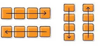
This establishes the main axis thus defining the direction flex items are placed in the flex container.
Flexbox is a single direction layout concept , think of flex as primarily laying out either in horizontal rows or vertical columns.
.container {

flex-direction: row | row-reverse | column | column-reverse;
}
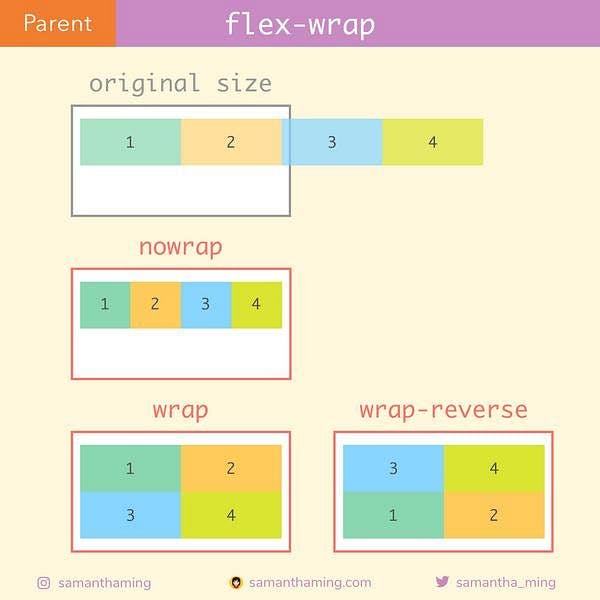
Flex-Wrap:
By default , flex items will all try to fit onto one line. We can change that and allows the items to wrap as needed with this property.
.container {

flex-wrap: nowrap  | wrap | wrap-reverse ;

}
Flex-flow:
This is the shorthand for the flex-direction and flex-wrap properties , which together defines then flex container's main and cross axes. The default value is no-wrap.
.container {
flex-flow : column wrap ;
}
Justify-content:
This defines the alignment along the main axis. It helps distribute extra free space leftover when either all the flex items on a line are inflexible, or are flexible but have reached their maximum size. It also exerts some control over the alignment of items when they overflow the line.
.container {

justify-content: flex-start | flex-end | centre | space-between | space-around | space - evenly | start | end | left | right

}
align-items:
This defines the default behavior for how flex items are laid out along the cross axis on the current line. Think of it as the justify-content version for the cross-axis (perpendicular to the main-axis)
.container {
  align-items: stretch | flex-start | flex-end | center | baseline | first baseline | last baseline | start | end | self-start | self-end + ... safe | unsafe;
}
align-content:
This aligns a flex container’s lines within when there is extra space in the cross-axis, similar to how justify-content aligns individual items within the main-axis.
.container {
  align-content: flex-start | flex-end | center | space-between | space-around | space-evenly | stretch | start | end | baseline | first baseline | last baseline + ... safe | unsafe;

}
Gap , Row-gap , Column-gap:
The gap property explicitly controls the space between flex items. It applies that spacing only between items not on the outer edges.
.container {
  display: flex;
  ...
  gap: 10px;
  gap: 10px 20px; /* row-gap column gap */
  row-gap: 10px;
  column-gap: 20px;
}
flex-grow:
This defines the ability for a flex item to grow if necessary. It accepts a unitless value that serves as a proportion. It dictates what amount of the available space inside the flex container the item should take up.
If all items have flex-grow set to 1, the remaining space in the container will be distributed equally to all children. If one of the children has a value of 2, that child would take up twice as much of the space either one of the others (or it will try, at least).
.items {
flex-grow : 4;  **/* default 0 */**
}
flex-shrink:
This defines the ability for a flex-item to shrink if necessary. Negative numbers are invalid.
.items {

flex-shrink: 3;   /* default 1 */

}
flex -basis:
This defines the default size of an element before the remaining space is distributed. It can be a length (e.g. 20%, 5rem, etc.) or a keyword. The auto keyword means “look at my width or height property” (which was temporarily done by the main-size keyword until deprecated). The content keyword means “size it based on the item’s content” – this keyword isn’t well supported yet, so it’s hard to test and harder to know what its brethren max-content, min-content, and fit-content do.
.items {

flex-basis: auto ; /* default auto */

}
align- self:
This allows the default alignment (or the one specified by align-items) to be overridden for individual flex items.
.items {
align-self : auto | flex-start | flex-end  | centre | baseline | stretch;

}
Conclusion:
Flex Learning provides an innovative answer for young people lacking the opportunity, intrinsic motivation or financial means to master academic content and skills, and ultimately to attain a diploma. The time has come for Michigan to take the lead in giving priority to the needs and potential of individual students. With a host of educational institutions and providers to call on, students should be able to take greater ownership of both their academic journey and their destination